In terms of web layout, I am keen to utilise elements of fashion through pictorial layout hence why I have been looking at fashion magazines on a digital platform for inspiration.
I believe the website for Another has a very feminine and attractive style of layout, as well as simple navigation, this is something I aim to develop on my website mockup.
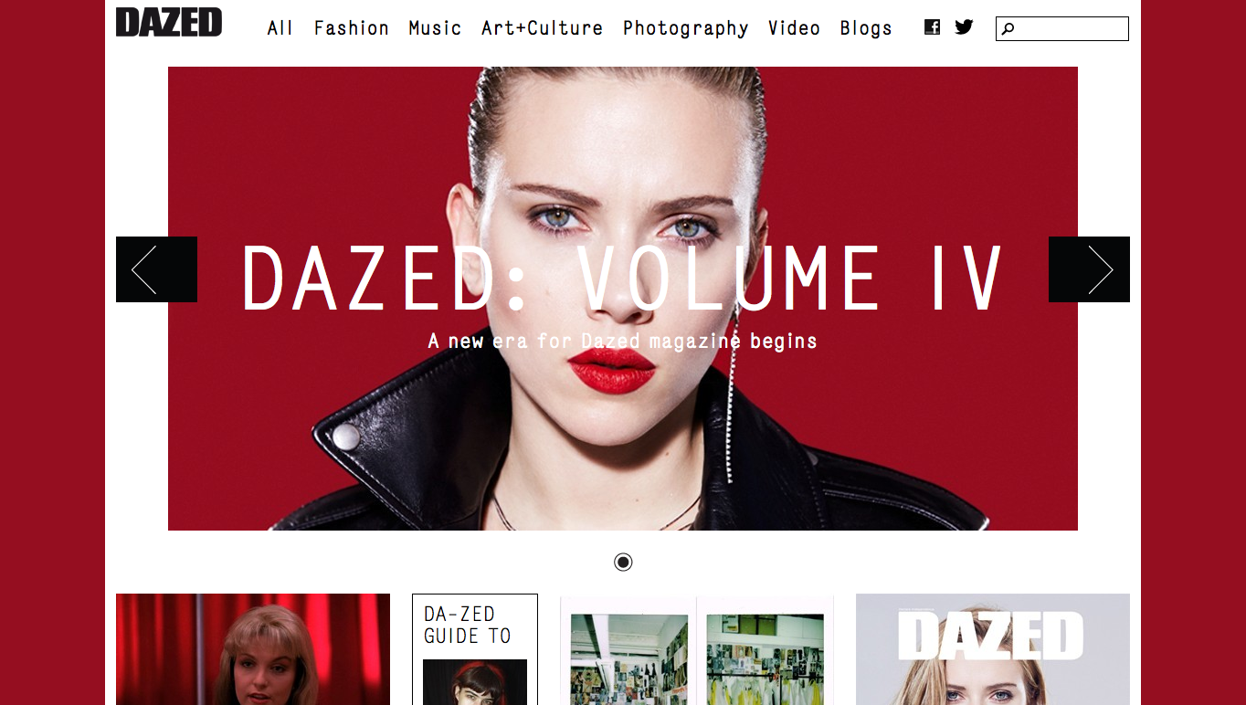
Dazed delivers a striking layout through the use of bold colours, large text and box space in sync with the type of work they have available online. This is a design quality I should bare in mind as I want the web layout to be fitting to the content it delivers.
Vogue has a very high fashion style to it, this isn't particularly the style I want for the Pink Ink website, however the use of white space and grid layout is key.
Paternity has the perfect layout in terms of font and image size, it is clean, fresh and has the correct amount of white space to look minimalistic white out looking bare.


No comments:
Post a Comment