Tuesday 25 February 2014

Extended practice || Tutorial feedback

Issues discussed in the tutorial:

Today I had a 15 minute tutorial with Amber to discuss the briefs I have been focussing on through out the year.

- Tiger Print
- D&AD
- Butterfly Project
- Pink Ink
- Albino Strawberry Boutique
- So&So's

Tutor feedback:

My feedback from Amber was positive in the sense I am very focussed this year and have a sense of direction in the type of design I aim to produce/ have produced.

The quantity and quality of work I am processing has improved a lot since the beginning of the year however the pace of work still lacks therefore I need to plan and timetable myself effectively to get all of the briefs done before the final hand in.

Action to be made:

- Complete all unfinished briefs (e.g finish printing/ photograph work)
- Re-work briefs which need changes made
- Calculate number of briefs
- Extend design context into written briefs for extended practice/ ppp

Pink Ink || Swatch book cover designs

I decided to digitalise the designs to give me an aides of which I would like to use for my the swatch book front cover. 


Below are my two favourites, the large type is well suited and best placed on the covers. 


Pink Ink || GF Smith colour plan || Swatch book inspiration

GF Smith's colour plan series is a great example of the style of design I wish to create for my swatch book, to display all the colours, designs and fabric samples I have developed for this brief. 


The colour plan designed by Made Thought displays a refreshing and contemporary style of graphic design perfect for the GF Smith company. I aim to take inspiration from this to develop my own swatch book. 


Monday 24 February 2014

Pink Ink || Website layout

TRENDS


Pink Ink || Web layout inspiration

In terms of web layout, I am keen to utilise elements of fashion through pictorial layout hence why I have been looking at fashion magazines on a digital platform for inspiration. 


I believe the website for Another has a very feminine and attractive style of layout, as well as simple navigation, this is something I aim to develop on my website mockup. 


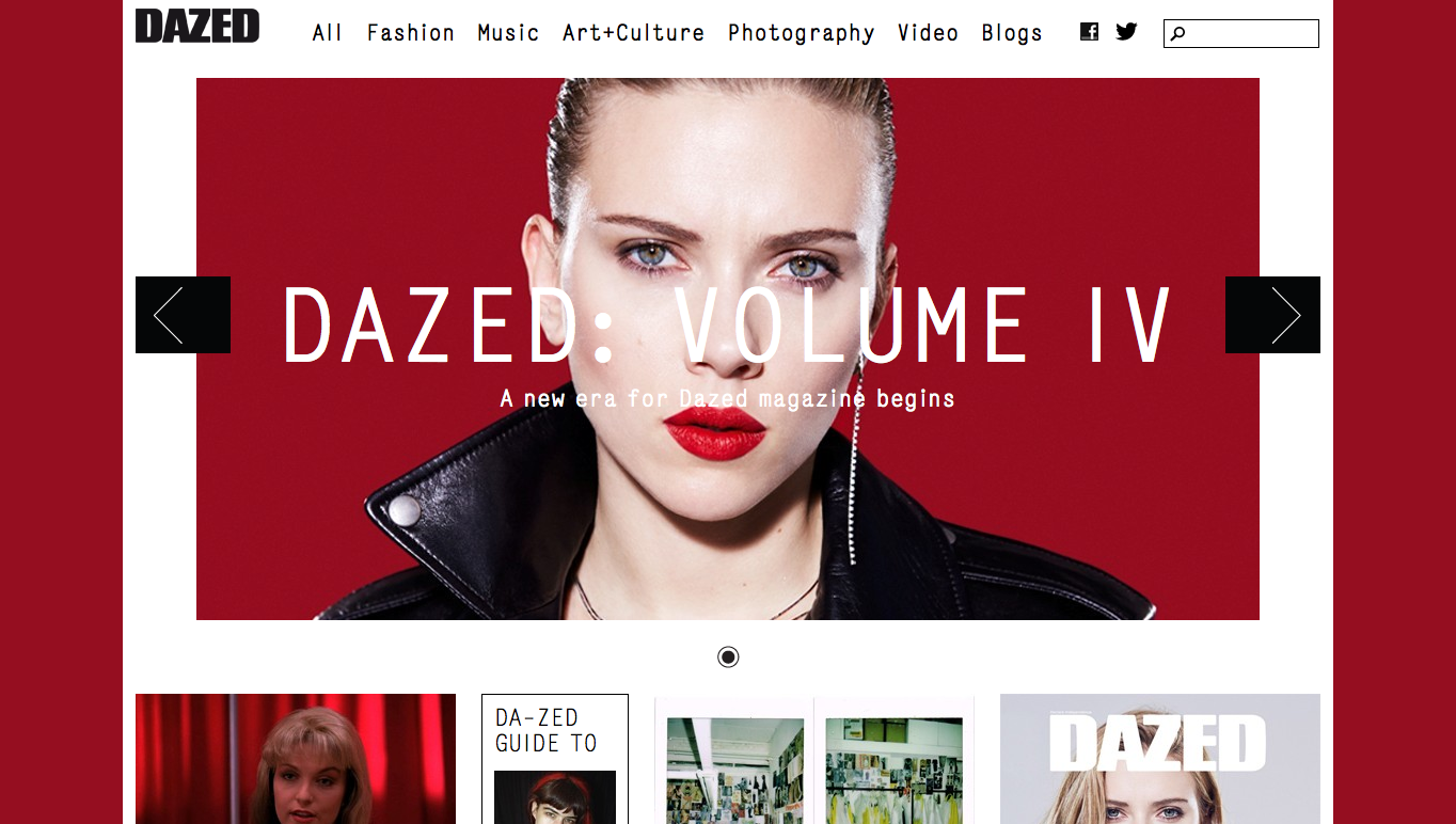
Dazed delivers a striking layout through the use of bold colours, large text and box space in sync with the type of work they have available online. This is a design quality I should bare in mind as I want the web layout to be fitting to the content it delivers. 


Vogue has a very high fashion style to it, this isn't particularly the style I want for the Pink Ink website, however the use of white space and grid layout is key. 


Paternity has the perfect layout in terms of font and image size, it is clean, fresh and has the correct amount of white space to look minimalistic white out looking bare. 


Pink Ink || Logo development

Below are a few font experimentations, the idea was to play with logo PinkInk in a range of fonts, weights and letter spacing to create a variety of logo ideas. 


I have decided on the Hype - Bold font for the logo. I believe from the range of weights and letter spacing, the below name works best and appears most legible and would work well for both print and web.


I think that the fonts Hype, Code and Neou will all be suitable to use for body text on the website mock up or in the visual magazine. 

Pink Ink || Design sheets

Branding and identity


Print


Web