Thursday 22 May 2014

Extended practice || End of year evaluation

1. What skills have you developed through this module and how effectively do you think you have applied them?

Learning new skills has been really important and relevant to my design practice this year, I feel I have excelled in grasping new skills in areas of design such as fashion, print, textiles and surface design. All of which relate to graphics as I am concentrating on being a graphic designer within the fashion industry. In terms of design skills I think I have developed a good understanding of digital photography, image editing, design and print, exploring all of these avenues in my practice has made me a feel like a more versatile graphic designer with a huge interest in fashion graphics, and textiles. Developing an understanding of digital technology, environments and printing has massively inspired me and made more focused in the direction I am heading in as a young professional designer. Developing an understanding of printing on fabrics, and learning about materials used on textiles has given me interest in not only fashion but interior design and home furnishing. However, I have no desire to be an interior designer or fashion designer, but I feel grasping knowledge about other design sectors has pushed my skill set higher. I have gained an understanding of how to engage colour, pattern and trend imagery into my research which has proven to be beneficial in my practice for creative designs. I have capitalised on all of these skills due to writing briefs such as Pinkink and Albino Boutique which are concept, pattern and production driven, both of which I aim to carry on producing designs for after education because both are in a sense small business proposals for my own practice in design. 

2. What approaches to/ methods of design production have you developed and how have they informed your design development process?

I have primarily focused on digital resolution this year, mainly because its a development process I feel comfortable with and want to perfect in many areas. In terms of approach I feel I have came forward a lot from the beginning of the year where I slightly lost context of the graphic design I was producing, I felt off course in terms of who I was a designer, what I was producing and why. However the COP3 module helped me understand how to take inspiration from primary and secondary sources, and learn the contextual side of design. My method of design for most briefs has been funded by knowledge from reading books on design techniques, researching new printing methods, going out and take photographs to use in my briefs as a posed to using stock images or producing vectors or looking online for information. These are all design decisions I have made to improve my design practice throughout third year, to experiment and explore with designs much as I could whilst making use of library, print and working facilities. 


3. What strengths can you identify in your work and how have/will you capitalise on these?

I believe my software skills have improved massively. Adobe illustrator, Photoshop and InDesign are my strongest, I feel this is because I have made a significant choice to explore graphics software, digital design, photography and print with the aim of become a designer focused in the sector of graphics and fashion.
In terms of digital textile design I have gained an understanding of colour ways, pattern production, fabric printing and production for fashion. I have learned about fashion designers who create digital prints such as Alexander Mcqueen, Jonathan Saunders, Basso & Brooke, along with fashion labels who prepare prints for product and apparel such as Textile Federation, House of Holland and Asos. Learning about digital print, production and manufacturing has made me aware that I understand specialist knowledge in both graphic design and printed textiles, enabling me to feel confident that I can work in this industry. Reprographics for paper material and digital print for fabrics is a great strength I have gained this year, as the same advantages are developing my strengths and knowledge in graphics and fashion. 

4. What weaknesses can you identify in your work and how will you address these in the future?


My weakness every year for self evaluation is bad time management, unfortunately I always work best under pressure leaving some parts of my design practice to be scarified due to lack of organisation. 

At the beginning of the year I wrote a few briefs, some of which have been untouched and some not completed, this is partly because of bad time management and also because I lost interest in some of the briefs I had wrote, some of which didn't seem relevant to my practice, examples of these are Boho chic decor, 3d installation and so&so's. If I could do things differently I would have focused on writing better briefs at the time, to save time on the practical element. 

5. Identify 5 things that you will do differently next time and what do you expect to gain from doing these?

Considering this is my last year at college, i'll identify what i'll do differently after education:

- Don't waste time, and do work as soon as it given to me to show I am effective with my time, hard working, professional and reliable. 
- Never forget my audience , this year has been a whirl wind interns of the briefs I have done and what I've designed, sometimes I forget who my audience is and why I'm designing when i'm working on a brief I written because its essential not real, however constant evaluation and feedback from peers always helps and this is something I need to keep up with. 
- Be confident in the work I produce, often enough I feel disappointed with concepts, designs and final outcomes of my briefs because I over think things. Allowing myself to produce good work, be confident in what it is and pitching it well is something I will capitalise after education. 
Don't get too stressed, letting things build up never helps anyone being creative, so my aim is to be stress free and happy about what I'm doing and why. 


6. How would you grade yourself on the following areas:

Attendance: 4
Punctuality: 4
Motivation: 3
Commitment: 4
Quantity of work produced: 5
Quality of work produced: 4
Contribution to the group: 5

Extended Practice || Briefs

Lisa Marina Burns OUGD603

BRIEFS 

Folder & Blog

Albino Boutique 

Butterfly Project 

Dialogue

Ditto

Design Context 

Exhibition of Paris

Fashion Branding

Pinkink

Pixelate and Tessellate

Self Branding 

Sock range

Textile Federation 

Tiger Print

Visual memories pack

UNTOUCHED OR UNCOMPLETED BRIEFS 

So & So's

The jungle bar

Asian wallpaper

Boho chic decor

3D installation

PRESENTATION BOARDS 

Folder & Blog

All briefs

SELF EVALUATION 

Blog

Wednesday 21 May 2014

Fashion branding || Presentation boards || Evaluation

EXTENDED PRACTICE MODULE 
BRIEF COVER SHEET
LEEDS COLLEGE OF ART

Module Code: 
OUGD603

Module Title:
Extended Practice

Student Name:
LISA BURNS

Studio Brief Title:
FASHION BRANDING - LAURA RICHARDSON - FMP

Synopsis:

Fashion branding for Laura Richardson, a collaborative brief consisting of branding and identity, print, product and promotional material for the fashion student. 


List of deliverables(boards, resolutions, apps,etc)

Research
Design sheets
Initial ideas
Concept and design development
Printing experiments 
Final execution 
Photographs of final product
Presentation boards
Printed material


Evidence
(Series of business cards, posters, website etc)

Ongoing documentation on blog
Business cards
Swing tags
Creative CV
Brand guidelines booklet


Evaluation:

The collaboration brief with Laura Richardson was one of my favourite, and most successful projects of the year. I really wanted to the opportunity to produce fashion branding for another creative as it is an area of design I've always wanted to practice. The brief consisted of regular meetings, brainstorming sessions and bouncing ideas of one another to develop an understanding of what needed to be executed. I enjoyed the collaborative practice mainly because my knowledge in fashion graphics as improved.

As a graphic designer and knowing that communication is key in design, I emphasised on this when creating branding for the designer as I wanted to fully display a visual identity of what her and her design style was. From the collaboration I have gained knowledge in areas of fashion, such how to present work on concept boards in a fashion like manor, along with learning more about colour ways and how to utilise them in branding for fashion.

Experimenting in design with a fashion designer allowed me to be aware of another individuals design ethos, by exploring unconventional materials in fashion and design, and adding elements of this into the branding and identity was learning a skill in itself. Gaining an understanding of how to incorporate fashion into graphics was essential for me. In terms of print and processes, we were happy about the decision to digitally printing the branding material, the process was easy, cost effective and no fuss was needed in terms of additional processes as requested by the designer - simplify was key.

Design Context Publication || Presentation boards || Evaluation

EXTENDED PRACTICE MODULE 
BRIEF COVER SHEET
LEEDS COLLEGE OF ART
Module Code: 
OUGD603

Module Title:
Extended Practice

Student Name:
LISA BURNS

Studio Brief Title:
Design context publication - Inspiration

Synopsis:

A brief which summaries me as a person and as a creative. The publication signifies my inspirations and influences in relation to graphic design and fashion, my aspirations in career choice and goal achievements as a young designer. 

List of deliverables(boards, resolutions, apps,etc)

Research
Initial ideas
Concept and content
Layout and editorial 
Final execution 
Photographs of final product
Presentation boards
Printed material


Evidence
(Series of business cards, posters, website etc)

Ongoing documentation on blog
Design development
Printed product


Evaluation:

The design context publication resulted in being one of my favourite final out comes this year. The magazine style publication which I produced basically summed up everything I like in the creative industry, so of a reader this booklet would give them a full insight as to who I am and what I like to design. My approach to producing this magazine was to write myself a set of questions and answer them in detail in relation to the context of practice. Doing this was really helpful as it clarified who I am and where I belong in the design sector. Over all I was really pleased with the end result of the magazine as it showed of my layout and editorial style along with how I present imagery, this magazine would be a good piece of work to take to an interview as it states exactly who I am and what I enjoy. The only fault I have with this brief is the photographs I took of the final product aren't the best so this is something I need to improve when shooting again for the presentation of my portfolio. 

Butterfly Project || Presentation boards || Evaluation

EXTENDED PRACTICE MODULE 
BRIEF COVER SHEET
LEEDS COLLEGE OF ART
Module Code: 
OUGD603

Module Title:
Extended Practice

Student Name:
LISA BURNS

Studio Brief Title:
Butterfly Project

Synopsis:

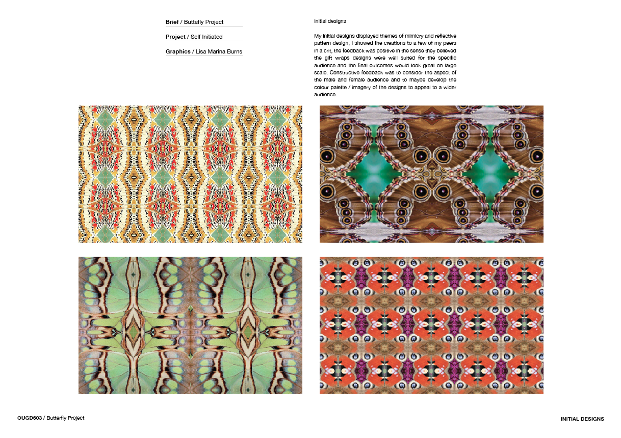
A brief based on the exploration of photography, digital design and print. The concept being butterflies, a subject to explore reflective pattern design to generate a range of print suitable fro stationary. 


List of deliverables
(boards, resolutions, apps,etc)


Research
Initial ideas
Concept and design development
Printing experiments 
Final execution 
Photographs of final product
Presentation boards
Printed material


Evidence
(Series of business cards, posters, website etc)

Ongoing documentation on blog
Digital design development
Printed products


Evaluation:

This was a brief I started quite early on in the year, one which I enjoyed a lot as the design and development process lead me on to creating a range of digital designs. The initial inspiration for this brief was a trip to London, and visiting a live butterfly exhibition, capturing photographs of the insects is what lead me to write a brief based on the concept of butterflies. The brand in which I chose to design the gift wrap for is a company which I believed would be well suited for the final products in terms of target audience. Anthroplogie/ Urban. Inc are retail changes I would like to design for one day so it seemed appropriate to consider the company as a main aspect of the brief. 

Textile Federation || Presentation boards || Evaluation

EXTENDED PRACTICE MODULE 
BRIEF COVER SHEET
LEEDS COLLEGE OF ART

Module Code: 
OUGD603

Module Title:
Extended Practice

Student Name:
LISA BURNS

Studio Brief Title:
TEXTILE FEDERATION

Synopsis:

Textile Federation, a small fashion label in London offered applicants the opportunity to apply to their 'entomology' scarf competition. A design which would be sold in the Oxford Street Topshop in London. 


List of deliverables(boards, resolutions, apps,etc)

Research
Initial ideas
Concept and design development 
Final execution 
Photographs of final product
Presentation boards
Printed material


Evidence
(Series of business cards, posters, website etc)

Ongoing documentation on blog
Digital designs of prints for fabrics
Mock ups
Final scarf designs
Printed scarfs


Evaluation:

This was the only competition brief I entered this year, and turned out to be one of my most liked briefs. Exploring with graphics, print and textile design has been a running theme throughout my practice this year so I wanted to get involved with a competition which would give me the opportunity of potentially seeing my design printed and in store.

Using the method of photographic print design in this brief allowed me to experiment with photography, image manipulation, pattern design and printed textiles. I enjoy using Adobe Photoshop and Illustrator for graphic design and felt the desire to explore and experiment in the design sector of textiles too. Developing an understanding of digital design and print has led me to be massively interested in this area, participating in briefs like this is the reason I enjoy both graphics and  textile print, and often like to combine the two together to gain a more explored practice.


Albino boutique || Presentation boards || Evaluation

EXTENDED PRACTICE MODULE 
BRIEF COVER SHEET
LEEDS COLLEGE OF ART

Module Code: 
OUGD603

Module Title:
Extended Practice

Student Name:
LISA BURNS

Studio Brief Title:
ALBINO BOUTIQUE

Synopsis:

Albino Strawberry Boutique - A unique branding project and business proposition for a print boutique based in Paris. The boutique offers pastel themed prints suitable for textile and garment decoration.

List of deliverables(boards, resolutions, apps,etc)

Research
Brand and identity
Pattern experimentation 
Pattern in context 
Mockups
Fabric samples
Supporting printed material
Project file - initial ideas
Participant art work
Promotional video
Photographed final products
Presentation boards

Evidence
(Series of business cards, posters, website etc)

Printed and digital material


Evaluation:

I wrote this brief with the intention of hoping some day it could be a project took further in terms of design and outcomes. So far the self initiated, collaborative and artistic input work that has been produced for the brief is something i am really pleased with. The deliverables are some of my favourite outcomes in terms of my resolutions this year. The branding and identity for this brief in particular, an organisation based on pastel colour, pattern and print is something I have wanted to produce for a while.
The proposal brief to be based in Paris was after a recent trip there visiting galleries, museums and print shops to collect pieces of information whether it be primary or secondary. I enjoy visiting places to gain inspiration and the trip to Paris was massively helpful in terms of my design practice. Living in Paris is a choice i'd defiantly consider and running my own buisness - a print boutique is a definite aspiration of mine. The brief was perfect for getting others involved and taking part in collaborative tasks to improve and provide outcomes I couldn't do myself.
Collaborating with Greta from graphics and the digital film and animation boys allowed me to involve elements of installation, photography and film, this advantage led to a broader range of work for the brief.
In terms of products I produced a range of printed materials from packaging to gift wrap, stickers, gift tags and business cards all with the aim of working together as range of products to signify Albino boutique.

Tuesday 20 May 2014

Ditto Press || Presentation boards || Evaluation

EXTENDED PRACTICE MODULE 
BRIEF COVER SHEET
LEEDS COLLEGE OF ART

Module Code: 
OUGD603

Module Title:
Extended Practice

Student Name:
LISA BURNS

Studio Brief Title:
DITTO PRESS - LIVE BRIEF

Synopsis:

Produce an archive of something that will be useful to you. - Ditto 


List of deliverables(boards, resolutions, apps,etc)

Concept and design development 
Final execution 
Presentation boards
Printed booklet


Evidence
(Series of business cards, posters, website etc)

Ongoing documentation on blog
Printed material


Evaluation:

In terms of concept I feel I understood the brief and reacted to it with a personal approach to an archive, I enjoy using flowers as a subject in my designs so it seemed only natural to use them as a sources of inspiration and apply a context connection to them which would be useful to me. I'm always looking for new colour palettes and putting design inspiration boards together create a style before proceeding with final designs. I thought of archiving flowers and having colours to match the individual blooms connotation would be subjective, helpful and over all visual pleasing for anyone to read. In terms of final execution I think I could of produced something better, I don't think the the fold out leaflet did the photography and content justice and if I had more time I would change the final resolution of this brief as I feel it was cut short to to lack of organisation. 

Dialogue || Presentation boards || Evaluation

EXTENDED PRACTICE MODULE 
BRIEF COVER SHEET
LEEDS COLLEGE OF ART

Module Code: 
OUGD603

Module Title:
Extended Practice

Student Name:
LISA BURNS

Studio Brief Title:
DIALOGUE

Synopsis:

The theme of the exhibition is ‘dialogue’ where each creative will submit a design that will be used in a blind collaboration.

List of deliverables(boards, resolutions, apps,etc)

Designs
Resolutions
Printed execution at exhibition
Photographs of final product
Presentation boards

Evidence
(Series of business cards, posters, website etc)

Poster
Mockups
Final resolution


Evaluation:

Participating in an exhibition like this was fun in terms of producing a quick design to be printed and displayed alongside many other artistic designs. In terms of the final resolution the floral print idea was just a quick turn out, not much development was considered as there was a tight deadline. Engaging with other peers and providing a design for an a real audience was exciting and I was genuinely interested in the exhibition element to the brief. 

Sock range || Presentation boards || Evaluation

EXTENDED PRACTICE MODULE 
BRIEF COVER SHEET
LEEDS COLLEGE OF ART

Module Code: 
OUGD603

Module Title:
Extended Practice

Student Name:
LISA BURNS

Studio Brief Title:
SOCK RANGE

Synopsis:

Chaos socks is a innovative label which creates colourful and fun socks designed in an array of styles and vast colour spectrums.

List of deliverables(boards, resolutions, apps,etc)

Research
Initial designs
Design documentation
Range of sock prints
Website 
Presentation boards
Printed material

Evidence
(Series of business cards, posters, website etc)

Ongoing documentation on blog
Mock up socks
Final sock designs 


Evaluation:

This brief was a quick turn around brief, initially I enjoyed the design aspect of it and idea of it being a small business idea for after education. However the final execution of the range and how it could be distributed was designed and developed rarely fast not leaving enough time for development or a good concept to be executed. 

Exhibition of Paris || Presentation boards || Evaluation

EXTENDED PRACTICE MODULE 
BRIEF COVER SHEET
LEEDS COLLEGE OF ART

Module Code: 
OUGD603

Module Title:
Extended Practice

Student Name:
LISA BURNS

Studio Brief Title:
EXHIBTION OF PARIS

Synopsis:


List of deliverables(boards, resolutions, apps,etc)

Trip to Paris
Research 
Photography
Animated + Digital outcomes
Blog
Presentation boards 

Evidence
(Series of business cards, posters, website etc)

Publication 
Blog


Evaluation:

Participating in an exhibition like this was fun in terms of producing a quick design to be printed and displayed alongside many other artistic designs. In terms of the final resolution the floral print idea was just a quick turn out, not much development was considered as there was a tight deadline. Engaging with other peers and providing a design for an a real audience was exciting and I was genuinely interested in the exhibition element to the brief. 

Pink ink || Evaluation

EXTENDED PRACTICE MODULE 
BRIEF COVER SHEET
LEEDS COLLEGE OF ART

Module Code: 
OUGD603

Module Title:
Extended Practice

Student Name:
LISA BURNS

Studio Brief Title:
PINKINK

Synopsis:

Develop a project based on the concept ‘pink’, collect and create designs which resemble, relate to and associate with anything pink. Use these designs to develop a collections of product and apparel. The aim for this brief is to experiment with a variety of techniques and processes to gain visionary work and effective finishes.

List of deliverables(boards, resolutions, apps,etc)

Research
Pattern experimentation 
Pattern in context 
Product and apparel mock ups
Fabric samples
Supporting printed material
Visual magazine 
Look book
Website
Pattern download packs
Photographed final products

Evidence
(Series of business cards, posters, website etc)

Printed and digital material

Evaluation:

“I wrote this brief with the aim of learning new skills in areas of design I hadn’t practiced in before, Pinkink is a brief of exploration, experimentation and innovation.”

This brief was inspired after I attended an exhibition at the Tullie House Museum & Art Gallery in Carlisle a while back to see the Turner Prize-winning Cumbrian artist called Keith Tyson.  One of my favourite artists, he produced a series of visual illusions he painting which have always intrigued me. The interesting process in which he creates the obscure natural designs is determined by the reactions between specially mixed paint and chemicals, poured at different angles and temperatures onto aluminium. His work inspired me to write a brief which fully focuses on experimentation of materials and processes to develop unusual outcomes. 

I investigated painting and printing processes such as marbling. Marbling is known as numerous names such as British or Japanese marlbing, Turkish Ebru or the art of Suminagashi, depending on the technique in which a design is produced. I developed an understanding of print procceses for paper and textile materials. 
I found inspiration from detailed cell structures from human and animal biology, natural patterns can be identified through the use of a micro scope, I picked up on this notion when considering the idea of using macro photography throughout the brief, a way of caputuring detailed designs.

I investigated artists who produced pattern work, each with different techniques. Artists with varying backgrounds in photography and design. Each working beyond their respective discipline they combine the mediums of painting, chemistry, sculpture, fashion and installation as a part of their image-making process. 
I gathered information based on printing techniques and photography in order to capture and produce my own set of creative designs through the use of mixed media. The brief was very concept driven, derived from the colour - pink and experimenting with inks, paints, print and photography, this enabled me to investgate unusal printing methods and processes to experiment with. 

I wanted to develop an understanding of colour, pattern and print in the design sectors of graphics, fashion and textiles. The best way I found of gathering inspirational imagery and knowledge was via Pinterest. It was the perfect platform to collect a system of images which would inspire and fuel the practical element of this brief. 
Websites such as Patternbank, Patternity, Trendstop and WGSN were ideal for understanding how forecasting of colour, pattern and print worked in both the graphics and fashion industry. Learning this encouraged me to continuously document colour schemes, trending prints and patterns on pinterest to show the cycle in visual inspiration which appealed to me. 

My inital designs were produced by experimeneting with paints, inks and unconventional additions to create a series of patterns through chance and process. I generated a collection of designs in phases, each depending on the media I used. 

The process in which I edited the photographs I had taken, was purely experimental, I took inspiration from the colour and pattern concept boards I had earlier designed, and used them as a basis to create patterns from photographs. These designs were digitally manipluated into illusional patterns. 

Developing the pattern process is where I introduced the marbling techniques, from watching youtube tutorials I produced some colourful patterns with my DIY kit at home, this consisted of oil paints and turpintine. I was happy with the results of the patterns I was making, I photographed the creations to archive the collection of marble prints. 

After a lengthy exploration of processes, print techniques and photography I developed a clear understanding of how to produce pattern designs and apply them to products to show them in context. This came by mocking up prints on interior and textile ranges to show the versatility of the prints. The mocking up element of this brief was essential as I needed to show how the pattern designs could be visualised on real products. 

The most significant part of the brief was branding and identity, producing the logo to be spread across a range of supporting material such as a website, a magazine, swing tags and headers for the fabrics samples, initially I produced most of this material with the thought of having this brief in my end of year graduate show, so developing collection of branded products seemed essential at the time. 

The most enjoyable part of the brief was producing digital designs for apparel, I produced collections of designs which displayed layering photographic imagery into repeated abstract designs, suitable for wear.  I established a clear grasp of how to drape patterns onto clothing from using Adobe Photoshop and Illustrator, this method of working has learned me new skills in mocking up which is essential in graphics design and fashion. 

The use of photography in surface pattern and textile design was a design decision i made early on, being able to manipulate and transform an image into a textile design allows great outcomes due to the fact its can be digitally printed onto fabric showing immense detail. Formatting photographic prints onto fabric allowed me to develop a very abstract style for fabric production as the process consisted of producing practicing and printing. 

Overall i feel the concept of this brief has stretched so far I have almost took advantage of the initial brief, but in a good way, writing myself such a vague yet contextual task has allowed me to experiment in many avenues of design this year. This has been my favourite brief of third year and my plans to carry on building the Pinkink website and publishing print magazines are almost certain. I feel the brief is too far fetched to have an official deadline and instead consider it as a starting point for looking into the future of myself and my desire to work in the graphics and fashion industry.